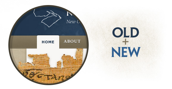
Sneak Peek: Ancient Text Meets HyperText
May 26, 2011
New Name. New Design.
September 22, 2010
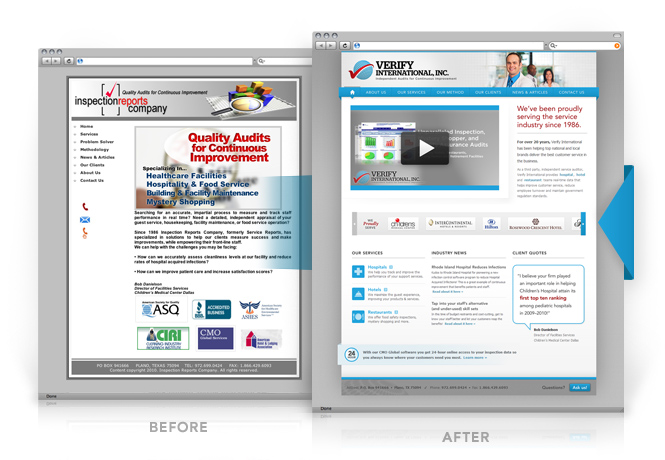
When Monte Fulton first contacted me he was in the midst of a total company re-brand. Now, for a young startup this wouldn’t be mentionable, but Monte’s been in the business for almost 25 years. So a decision like this didn’t come easily. He knew it meant a fresh start from top to bottom.
And that’s what he did. He re-named. He re-branded. And we re-designed. Using his new logo (designed by the fine folks at Inkd) as a jumping off point, we rewrote his web content from scratch and re-designed the whole site. You can see the results at VerifyInternational.com.
Below is a little before-and-after comparison. (And no, not the crazy kind you see in those ads for varicose vein removal.) Congratulations to Monte and the whole Verify team for having the vision and dedication to bring this project to completion.
Two Recent One-page Websites
April 8, 2010
Friends of CSNTM is a non-profit organization that works to support the Center for the Study of New Testament Manuscripts in their work to digitally preserve ancient copies of the New Testament. They needed to spread the word about their 2010 fundraiser and they needed an easy way for people to sign up for their monthly e-newsletter. Both provided great opportunities for one-page, stand alone websites because they had a targeted audience and a precise call-to-action. Using a single page that was visually connected to their main website but minus some of the tangential clutter (e.g., primary navigation, header images, etc.) was just the right tool for the job. The end result was two visually compelling pages that were able to engage the visitor more directly.
The finished product: the fundraiser page & the newsletter sign up page.
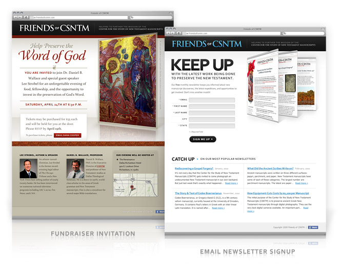
If you’re looking for highly-targeted website marketing, a one-page website may be just what you need. Learn more »
Developer Tools in IE8
February 13, 2010
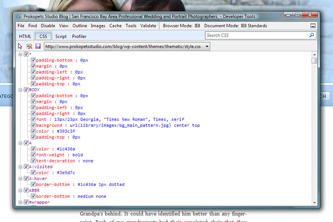
Who knew Internet Explorer 8 had built-in developer tools? It validates CSS and HTML and even has a ruler and color picker. Not too shabby. You can access them with the F12 key or under the Tools menu. Once the developer tools window is open, Ctrl + B is the shortcut for inspecting an element on the page. This makes coding pixel-perfect designs so much easier. I sure wish I had known about this a few months back.
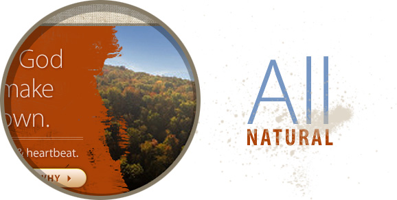
Sneak Peak: The Natural Choice
January 24, 2010
Details, Details, Details…
August 21, 2009
They say the Devil is in the details. I don’t really know why they say that, but if their point is that details are important, then consider me in happy agreement. Details are often overlooked in web design and that’s a shame because it’s careful attention to detail that pushes a good design beyond the point of mediocrity.
In one of my current projects I found a good opportunity to do just that. I had two pieces of content that needed to be separated visually. The obvious way to do this is by drawing a nice thin line between the two. But, since the content I was working with sat nicely on the same lushly-patterned background, I knew I had fertile ground for planting some great detail into the design.
So, rather than a solid, single-color line to separate the two sections, I gave the line a slight bevel so that it looks as though it’s been carved out of the background. And to heighten the effect even more, I removed a few sections of the divider so that the background could pop up and over it. Perfect.
The end effect is a touch more depth and bit more interest in this particular design. Smatter these sorts of details throughout your design and you’ll be on your way past mediocrity in no time.
More Wedding Photos
July 13, 2009
I just updated our wedding website with pictures from our wedding and honeymoon. Don’t miss them.
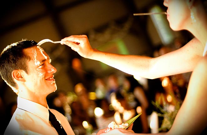
The wedding photos were taken by Sarah McCormick, Kris’s sister.
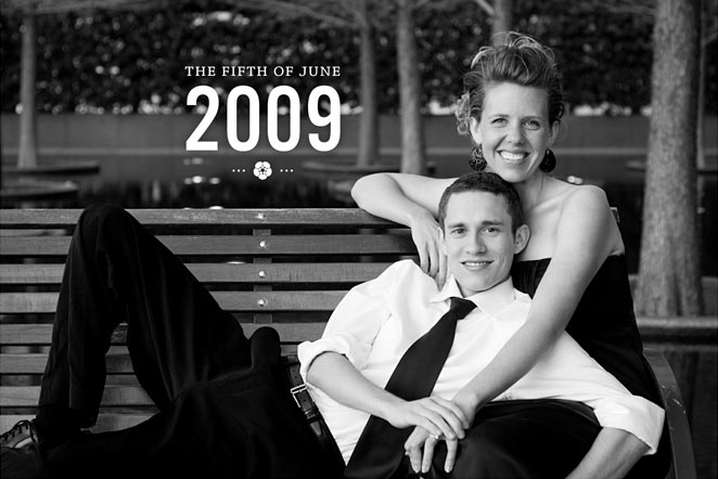
Engagement Photos
April 19, 2009
I just uploaded our engagement photos over at GurryWedding.com. They turned out wonderfully. Vitaliy took them back in April when he flew out for my birthday.
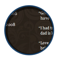
Sneak Peak: Wedding Website
April 19, 2009

Gabriola: New Script Font for Windows 7
April 2, 2009
Microsoft has always been a leader in typographic design for the screen. Windows Vista shipped with no less than six new typefaces designed specifically for screens by some of the world’s best type designers.
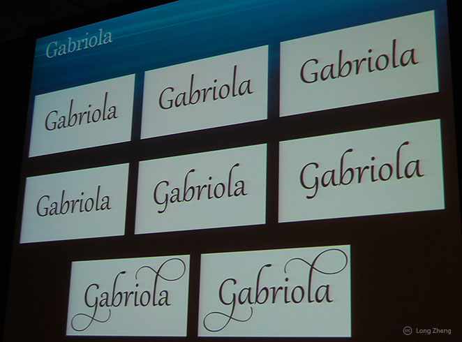
It looks like Microsoft is keeping type a priority because the latest edition of Windows has some exciting new developments in the font arena. Granted, some of these improvements are long overdo, but they’re welcome improvements just the same.
One of these developments is a lovely new script named Gabriola. Inspired by Flemish roots, it is being developed by Ross Mills John Hudson of Tiro Typeworks (who also designed Constantia) and takes full advantage of OpenType features. Now if Microsoft could just get those features available in Office people could actually start taking advantage of them. Here’s hoping they do that.
Along with Gabriola, perhaps the best new typographic feature in Windows 7 is the ability to turn fonts off and on directly through the OS. Currently, one needs third party font software to do that. It seems to work like this:
By "hiding" fonts, they are still technically installed in your OS but not enabled to applications, this reduces the number of fonts to scroll through and also memory. First, Windows 7 will automatically hide fonts based on regional settings, but it will also allow you to show and hide them manually. [source]
One other improvement is better font rendering, especially in the horizontal dimension of curves. This was something Microsoft worked on with Vista, but it still needs some work in my opinion. I still see a lot of “jaggies” in Vista, even in the new core fonts like Calibri.
If the above image is accurate, I have to say that Microsoft has made significant improvements here.
Update: John Hudson chimes in on Gabriola over at Typophile with some nice screenshots and short description of his inspiration.
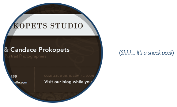
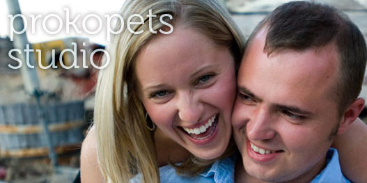
Sneak Peak: Prokopets Studio
February 19, 2009
Site (Re)design
February 7, 2009
It’s been five years since Gurry Design first went live. In those five years the design has pretty much remained unchanged. This would be insignificant if that original design had been something stellar. But lo, that was not the case.
The structure of the site worked fine, an ever-faithful two column layout that was just what I needed. And the typography, while not inspiring, wasn’t bad either. But that color scheme. Oh that color scheme. It just had no life in it.
So here it is 2009 and the design is five years old (which is ancient in web design years). The site is due for a redesign. But what’s a web designer to do when he doesn’t have enough time to design his own site? (Re)design, of course. You keep what what’s working and discard what’s not. This whole business of (re)designing isn’t too far from what Cameron Moll has termed “realigning.” It’s sort of pit stop on the way toward a full-scale redesign.
Hope you like it. 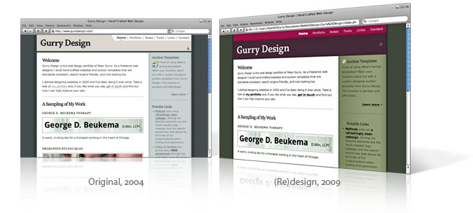
Ice Truck Takes A Dip
January 28, 2009
You know those big 2-inch thick metal plates they use when digging holes in the middle of the road? You know, the ones that give your car a jerk as you hit them? I’ve always wondered what would happen if one of those wasn’t well secured. Well a salt truck driver in Cincinnati found out.
Hot Off the Press: New Site for George Beukema
January 12, 2009
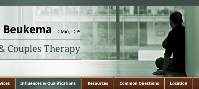
Just launched today, and in the works for a couple months, this project was done in collaboration with Scott Ruth of Scottyman Media. The full project included a brand new identity for George’s new practice. That identity needed to work across his website, business card, letterhead, and logo. Employing consistent typography, colors, and design elements, we accomplished just that.
In the future, I’d like to post a write-up about the process behind the design, but for now, enjoy this special sneak peek of the various stages along the way.
Great Photography from Great People
October 12, 2008
When it comes to picking a good photographer, personality can be as important as artistry. To get really great shots you want a photographer capable of capturing your one-of-a-kind character. Those kind of photographers are few and far between. But Vitaliy and Candace Prokopets are just that. These two are characters themselves and they have a way of bringing that out in their subjects. They are so much fun to work with. If you’re in the San Francisco area and you’re looking for great photography with a personal touch, look no further.
Here are a few of my favorite shots from a photo shoot Vitaliy and Candace did for me and my girlfriend this summer.
UPDATE: Vitaliy & Candace are giving away FREE photo shoots through the end of the year. If you’re in the Bay area, go get yourself some great photography at an unbeatable price.
Our Obsession with Perfection
October 21, 2006
I noted this in my links section of the homepage, but this video (it really isn’t fair to call it an advertisement) made by Dove is worth posting here. As someone fairly proficient in Photoshop, I can attest that the image editing towards the end is not only possible but probably routine in the advertising world. What a powerful look inside our society’s obsession with bodily perfection.
In the Works: Greek Latin Audio
June 20, 2006
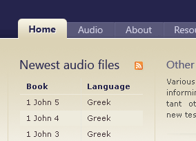
I recently started work on a pro bono project that I’m particularly excited about. Greek Latin Audio is a website that serves as an aid to students of the New Testament by offering free audio downloads of the New Testament read in both Greek and Latin. As I know first hand, listening to the New Testament rather than simply reading it helps one become immersed in the thought of the language not just the wording and structure. Of course, hearing the New Testament will lead to better proficiency in reading too, but becoming familiar with how the language sounds brings a new level of depth and understanding not found through reading alone. In the words of J. Gresham Machen:
A language cannot easily be learned by the eye alone. The sound as well as the sense of familiar passages should be impressed upon the mind, until sound and sense are connected without the medium of translation. [From The Minister and His Greek Testament.]
This project is still in its infancy and there’s much work to be done, but I thought a sneak peak was in order now that the initial design phase is done.
The Power of the Cross
April, 15, 2006
At our Good Friday service last night I heard a wonderful new hymn about the death of our Savior. Variously titled The Power of the Cross and Oh to See the Dawn, The words are worth printing here. In fact, I liked the words so much I combined them with Diego Velázquez’s painting “Christ Crucified” to create a desktop background. You can view a 1024×768 version for your computer, or if you like, download the original Photoshop file (3.3 MB).
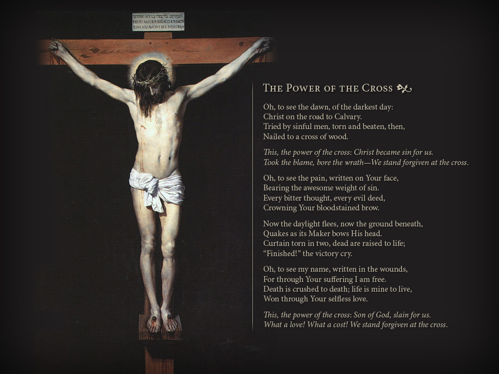
To set the picture as your desktop background, click the picture above to view a big version. Then right-click the big version of the image and select Set as Background.
Oh to see the dawn of the darkest day;
Christ on the road to Calvary.
Tried by sinful men, torn and beaten, then,
Nailed to a cross of wood.
This the power of the cross: Christ became sin for us,
Took the blame, bore the wrath—We stand forgiven at the cross.
Oh to see the pain written on Your face,
Bearing the awesome weight of sin.
Every bitter thought, every evil deed
Crowning Your bloodstained brow.
Now the daylight flees, now the ground beneath
Quakes as it's Maker bows His head.
Curtain torn in two; Dead are raised to life;
Finished! the victory cry.
Oh to see my name written in the wounds,
For through Your suffering I am free.
Death is crushed to death; life is mine to live,
This the power of the cross: Son of God, slain for us.
What a love! What a cost! We stand forgiven at the cross.
Still didn’t find what you were looking for? Try the Archives.